Gas stations have convenience stores.Charging stations are dropped in random parking lots.
Rivian gets it right at parks, trailheads + coastlines. The station is the destination. Everywhere else, you are scrolling Google Maps + dodging the idle fee.
I designed for what should be.
✷ the flows
In motion.
Three end-to-end flows from the original Figma prototype. Hover to play.
▶ play
Birdsong. Camille reclines back to recharge.
▶ play
Bakery. Hiro wants to pick up some baked goods from a bakery near the charging station.
▶ play
Dog Park. Marco and Moose go for a walk.
❀ what I designed
A car-UI + a text-message handoff. Not another app.
01
One mascot to break the silence.
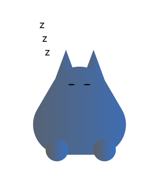
Tūī is a sidekick, not a chatbot. Greets you by name, breathes, blinks, naps when you're idle.
“I'm Tūī, your EV Charging Companion. I enjoy birds, napping on the job, and living rent-free in your car.”
Tūī, introducing himself
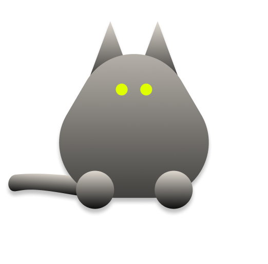
Awake. Tail out and alert.zzzIdle too long? He naps.
02
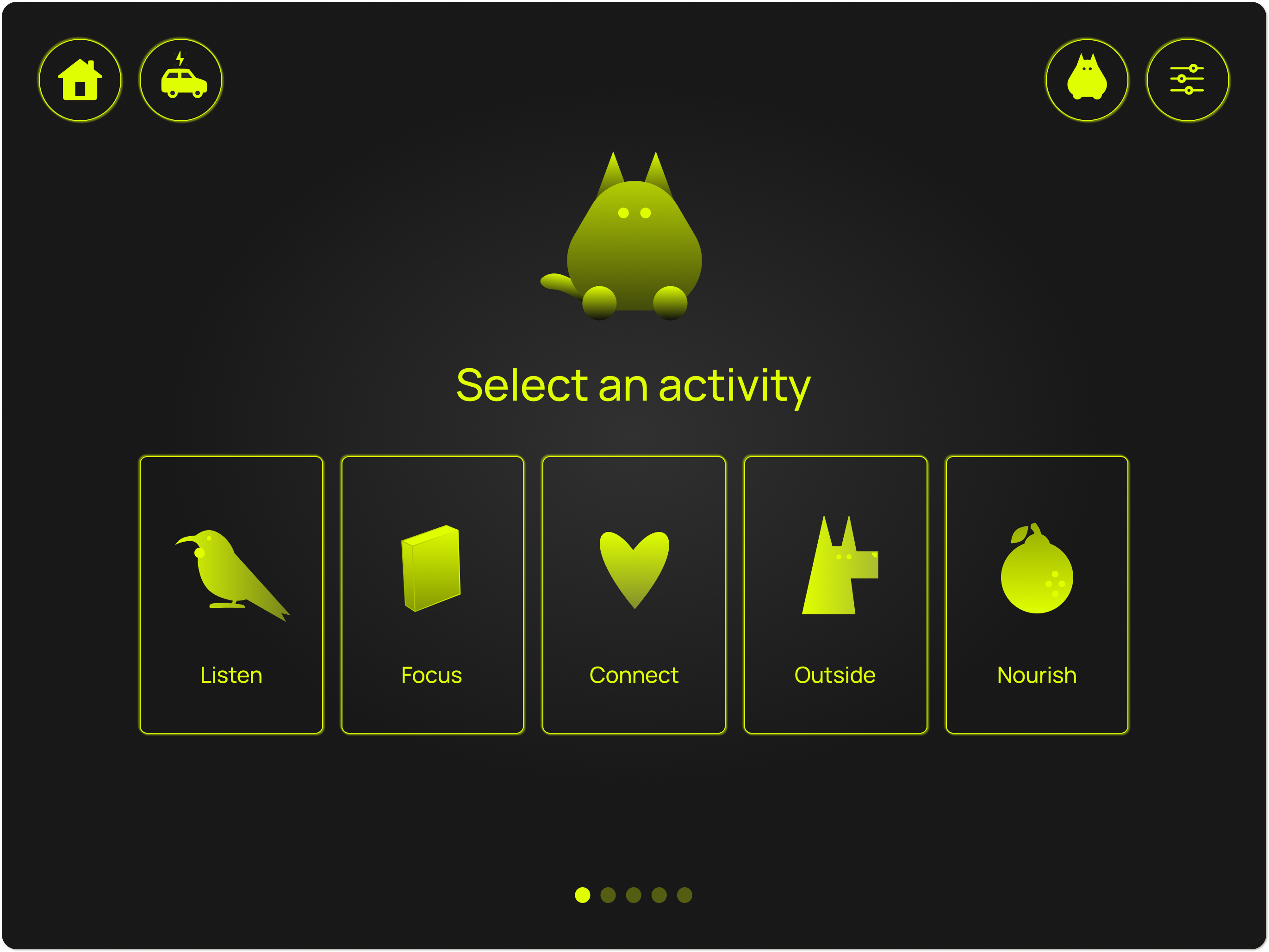
Five activities. Touchscreen-sized,finger-perfect.
Listen, Focus, Connect, Outside, Nourish. Five paths into the wait. Each card is a different reason to step out of the car or stay with intention.
Drawn in Figma w/ the pen tool.
03
One micro detail, hidden in plain sight.
When you finish picking an activity, getting directions, and choosing a charge level, confetti showers down the screen. One piece sticks to Tūī. Tiny but deliberate.
One piece always sticks.
04
A handoff to the phone, in simple communication.
Tūī never sends paragraphs. Charging started ⚡️🔌. Walking directions for the dog park 🐕. Charge almost done, head back 🔋🔌.
timeTūīcharging started ⚡️🔌dog park, 4 blocks away 🐕charge almost done, head back 🔋🔌
❖ glow-in-the-dark
For night.
The dashboard defaults to glow-in-the-dark, after dark. Easier on your eyes, easier to find what you’re after when the cabin’s dim.
Calm comes from removing, not adding.
✢ model context protocol
I tried to rebuild it through the Figma MCP.
I pulled my Figma frames + components into code, wired click hotspots, drove a sprite-based confetti shower.
It runs but it lacks soul.
The mascot doesn't animate. The slider doesn't behave. The Figma prototype is what stayed as the showcase.
Go ahead and test it out.
✢ reflection
What I'd build differently.
Tūī finished as a Figma prototype. Linked frames, animated transitions, lots of mascot iteration. None of the product’s soul translated to working code.
If I were starting today I'd build the UI in Rive and ship it in code from week one. The mascot would breathe in production, not just in Smart Animate. The slider would behave, not just demo. A prototype shouldn't be a screen recording. It needs to be a thing that runs.
✷ the backstory
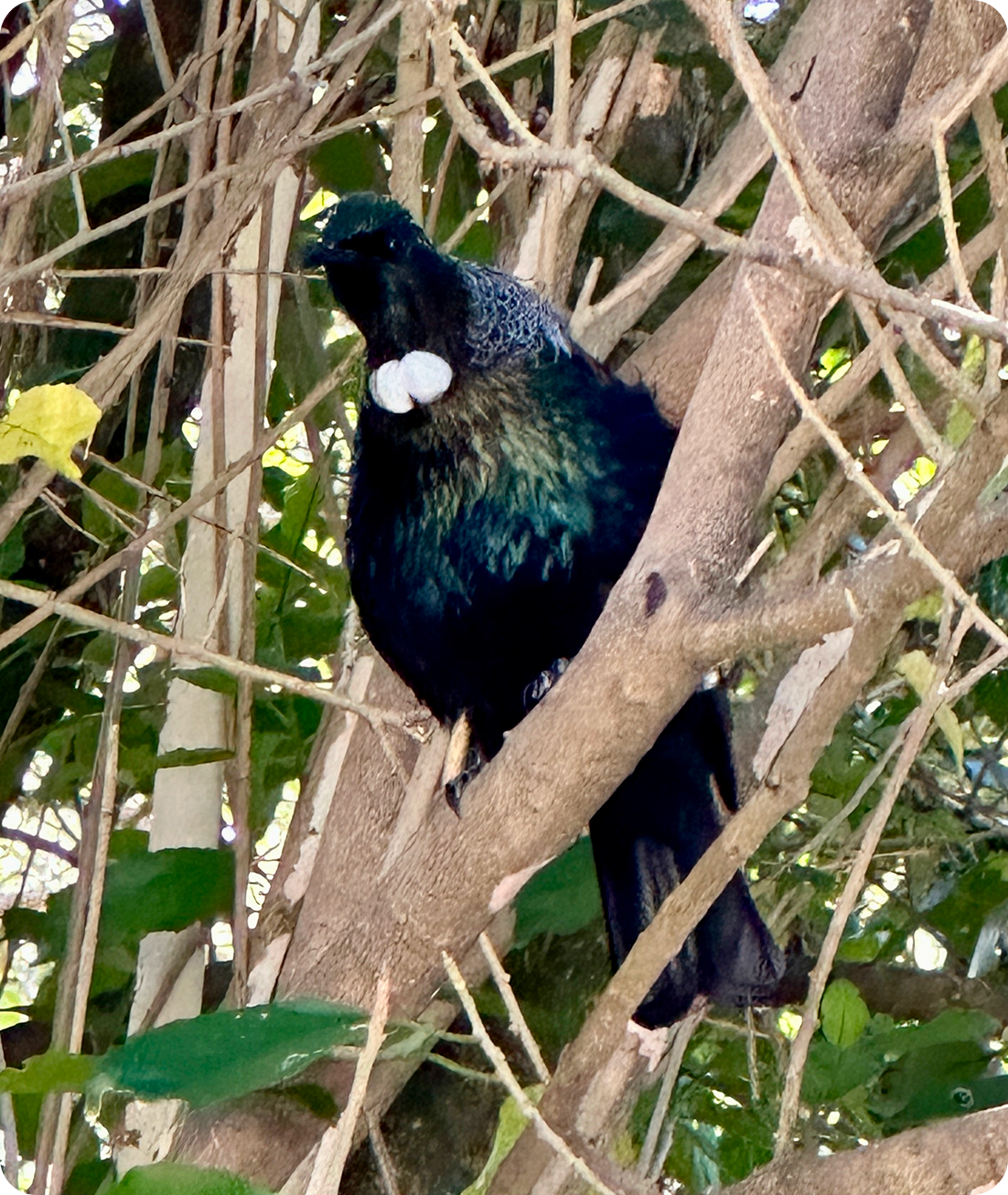
I named it after a New Zealand bird.
Tūī (the bird) is known for mimicking sounds and filling quiet spaces with melody. The blue-green iridescence is the exact palette I used for the mascot.
Tūī also stands for Transport User Interface. The car transports you, the app transports the wait, the bird signals movement.
A real Tūī I photographed in NZ. The brand colors come from him.
The Birdsong flow plays my field recording from the same trip.The full field recording. Fantail birds in the foreground, Tūīs in the back.
This recording is what made me want to build Lost & Endangered my next case story.